
A Look Back at 2016 Through Infobites

Working out the right visualization taking research, ideation, and experimentation.
Edahn Small is the Creative Director at Hypothesis. Contact Edahn Small at esmall@hypothesisgroup.com.
We finally made it to the end of 2016! Many of us are relieved to see 2016 go, a year filled with tragedy, celebrity deaths, and political turmoil. Throughout the year, our design team, Gridspace, has been tracking the pivotal events of 2016. From the environment, to politics, to economics, we dug into the data to demystify some of the controversies that dominated this year's news cycles while still serving up our signature design.
Our efforts paid off. This year we won our first design award through HOW Magazine for our dataviz work and we have plans in 2017 to give talks through AIGA about infobites and how to make data visualization fun, engaging, and consumable.
With nearly 130 posts in 2016, we wondered what posts grabbed the most attention, what topics predominated, what goes into the perfect infobite, and what goes into the worst infobite. After a couple days of data gathering and analysis, we made some interesting discoveries.
INFOBITE ANALYSIS

Looking back at our infobites tells us a lot about what this year was about, and without a doubt, the election dominated. About a quarter of all our posts this year were political, which is understandable given how polarizing this election was. National Days, such as National Camera Day, National Pancake Day, and even National Maritime Day (who knew?) were the second most popular topic. And sports, covering the controversial 2016 Olympics and some notable retirements, came in a close third. The most popular visualization type was a bar/column chart, and roughly one out of 10 posts features completely novel visualizations which we labeled "unique." Roughly a third of our posts this year were lightehearted (but informative!) which stayed true to our vision of creating an account that was both illuminating and entertaining.

When it comes to our aesthetic preferences, it seems like blacks, neutrals, and blues are our preferred colors of choice. No one likes yellow, apparently.

Our posts this year averaged a cool 20 likes. We nearly tripled our followers to 293, for which we say thanks to all our devoted followers! Now start commenting!

We analyzed each attribute to determine which color, topic, and visualization type were the most liked by our followers. This led to a formula for the most successful and unsuccessful posts. Unsurprisingly, unique visualizations and snail charts were the most liked, and famous quotes and tragedy were the topics that were most appreciated. No more pink bubble charts about education, it seems.

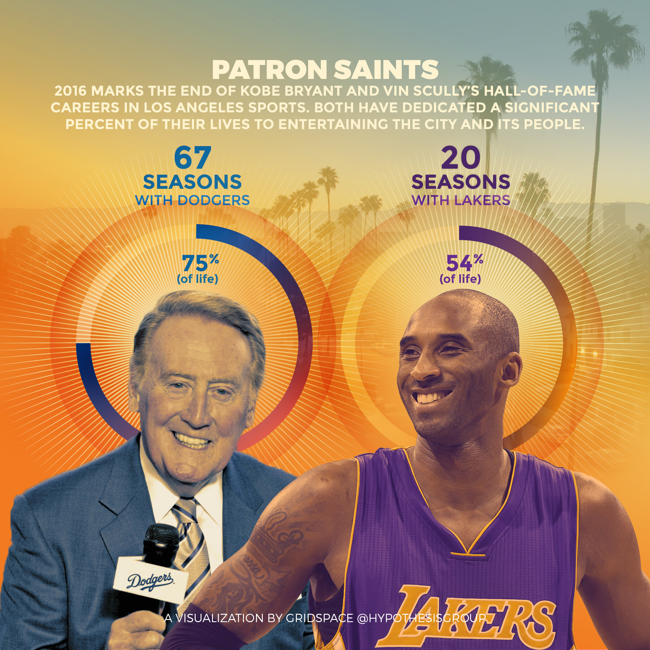
Featured below are our most-liked posts of 2016, from left to right.


I'd like to close off with a big thank you to all our amazing designers who poured their time into researching, refining, and designing the posts that light up our instagram account every week. Our instagram account is a personal source of pride for me, not just because of its uniqueness and novelty, but because educating and exciting people is what we do every day with our reports, and we've done that with our audience in a novel, fresh, and stylish way that is intrinsic to the Hypothesis ethos.

GET THE BOOK
Finally, we're excited to announce that you can now order a booklet of all our award-winning infobites from 2016. Contact Edahn Small at esmall@hypothesisgroup.com for details.
Happy holidays and cheers to more great work in 2017!